Radio Visualization

This project drew inspiration from my hobby as an amateur radio operator and my thesis project, where I aimed to visualize radio signals using Augmented Reality (AR).
In my thesis, I conducted an aesthetic analysis of the "Architecture of Radio" (AoR) application created by Richard Vijgen. This application offers a unique visual experience, allowing users to perceive their surroundings' otherwise invisible digital signals. Utilizing GPS and global datasets, AoR generates a 360-degree visualization of the "infosphere," showcasing nearby data hardware like cell phone towers and satellites. It represents digital radio signals as clouds of parallel lines reminiscent of contour lines on a topographic map composed of more miniature geometric figures in motion.
Furthermore, AoR immerses users in an auditory experience featuring low rumbles, crackles, and static noises that change with the device's movement. Inspired by software-defined radios, this soundscape adds an extra layer to the app's portrayal of the information layer. While not a measurement tool, it provides an interpretive glimpse into the typically invisible radio world.
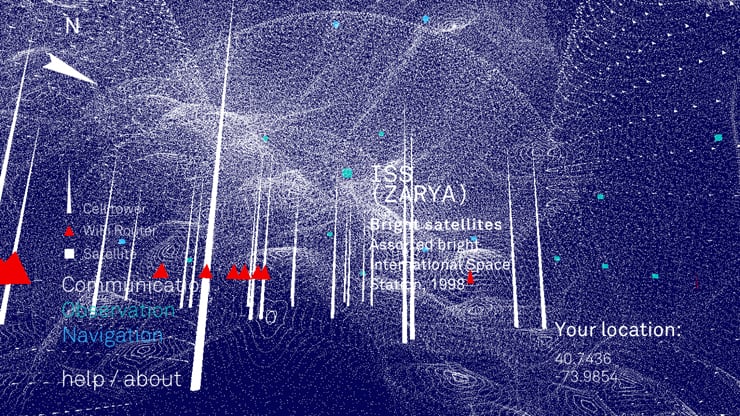
For my project, I aimed to understand AoR's color scheme and signal presentation, opting for a blue background and light colors to visualize the signals. The AoR application also influences the signal spread.
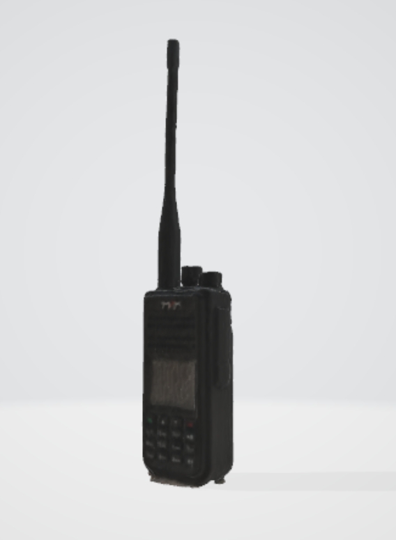
The model used was scanned from one of my walkie-talkies with Luma.AI, explaining the empty bottom part of the model.
You can find the demo here: Link, and the code here: Link.
